

When most small business owners think about their website, they usually picture it on a desktop computer. But here’s the reality:
Your customers are probably looking at it on a phone.
And if your website doesn’t work well on mobile devices, tablets, laptops, and larger desktop screens, you could be losing customers before they ever call, click, or fill out a contact form.
Let’s look at why responsive design matters more than ever in 2026, how it affects your Google rankings, and what you can do to make sure your website works for everyone.
The Numbers Don’t Lie: Mobile Is Dominating
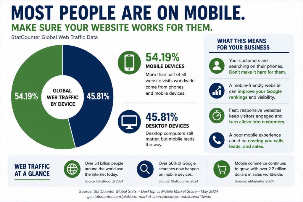
According to StatCounter’s latest global data, mobile devices now account for approximately 54% of all web traffic worldwide, with desktop devices making up roughly 46%.
Other industry studies report mobile traffic exceeding 60% globally depending on the market and industry.
For local businesses, the trend is even more important because many searches happen when customers are actively looking for a service provider nearby.
Think about your own habits:
- Looking for a restaurant? Phone.
- Need a plumber? Phone.
- Searching for a roofing contractor? Phone.
- Looking up business hours? Phone.
If your website doesn’t work smoothly on a smartphone, you’re creating friction at the exact moment someone is ready to become a customer.
What Does “Responsive” Actually Mean?
A responsive website automatically adjusts its layout and content based on the visitor’s screen size.
Instead of building separate websites for phones, tablets, and desktops, a responsive site uses flexible layouts that adapt to the device being used.
A properly responsive website should:
- Resize images automatically
- Adjust text for readability
- Stack columns on smaller screens
- Keep buttons easy to tap
- Prevent horizontal scrolling
- Maintain fast loading speeds across devices
In simple terms:
Your website should look intentional whether it’s viewed on a 6-inch smartphone or a 32-inch monitor.
Common Screen Sizes You Should Be Testing
While there are hundreds of device variations, these are some of the most important breakpoints to test:
Mobile Phones
- 360px wide
- 375px wide (many iPhones)
- 390px wide (newer iPhones)
- 412px wide (many Android devices)
Tablets
- 768px wide (iPad Portrait)
- 820px wide (newer tablets)
Laptops & Desktops
- 1280px wide
- 1366px wide
- 1440px wide
- 1920px wide
A website that looks perfect on your office computer may have overlapping text, broken buttons, or unreadable content on a mobile device.
Why Google Cares About Responsive Design
Google has been using mobile-first indexing for years.
That means Google primarily evaluates the mobile version of your website when determining how your site should rank in search results. Google specifically recommends responsive web design as its preferred approach.
In other words:
If your mobile experience is poor, your SEO can suffer—even if the desktop version looks great.
Google’s documentation also highlights mobile usability as a key component of overall page experience.
Core Web Vitals: Google’s User Experience Scorecard
Google evaluates websites using a set of performance measurements called Core Web Vitals.
These metrics focus on three key areas:
Loading Speed
How quickly visitors can see and interact with content.
Interactivity
How responsive the page feels when users click buttons or navigate.
Visual Stability
Whether elements jump around while the page is loading.
Google states that sites with strong Core Web Vitals provide a better user experience and align with what its ranking systems seek to reward.
The takeaway?
A beautiful website that loads slowly may still struggle to compete against a faster site with a better user experience.
How Slow Websites Cost You Customers
Imagine clicking a website and waiting…
And waiting…
And waiting.
Most visitors won’t.
Studies consistently show that users abandon slow websites quickly. Even a delay of a few seconds can significantly reduce conversions.
For local businesses, that means:
- Fewer phone calls
- Fewer contact form submissions
- Fewer appointment requests
- Fewer sales
Google notices these engagement signals too.
When visitors leave quickly because of a poor experience, it can negatively impact your overall search performance.
Free Tools to Test Your Website
The good news is that you don’t have to guess whether your site is performing well.
Google PageSpeed Insights
This free Google tool measures:
- Mobile performance
- Desktop performance
- Core Web Vitals
- Accessibility
- SEO basics
Google Search Console
https://search.google.com/search-console
Search Console provides real-world Core Web Vitals data from actual visitors and highlights pages that need improvement.
BrowserStack
Allows testing across dozens of devices and screen sizes without owning every phone and tablet.
Responsively App
A free tool that lets developers and designers preview multiple device sizes simultaneously.
Chrome DevTools
If you use Google Chrome:
- Open your website.
- Press F12.
- Click the Device Toolbar icon.
- Switch between common device sizes.
This is one of the quickest ways to spot mobile issues.
Quick Wins for Better Responsiveness
If you’re using WordPress and Elementor, these improvements often provide immediate benefits:
Optimize Images
Large image files are one of the biggest causes of slow websites.
Use Modern Formats
Convert images to WebP whenever possible.
Eliminate Unused Plugins
Every unnecessary plugin can add extra loading time.
Review Mobile Layouts Manually
Don’t assume Elementor’s automatic settings are enough.
Check Tap Targets
Buttons should be large enough for thumbs—not mouse pointers.
Improve Hosting
Even a perfectly designed website can feel slow on poor hosting.
The Bottom Line
Your website no longer has the luxury of being “desktop-first.”
Today’s customers expect a fast, seamless experience on every device they use. Google expects it too.
A responsive website isn’t just a design preference—it’s a business necessity.
When your website loads quickly, adapts to every screen size, and provides a smooth user experience, you improve:
- Search rankings
- User engagement
- Conversion rates
- Customer trust
- Lead generation
And for small businesses competing against larger companies, those advantages can make a significant difference.
If you’re not sure how your website performs across devices, now is the perfect time to run a few tests. You may discover opportunities that can improve both your Google visibility and your bottom line.