AI has made professional-looking advertising accessible to just about everyone. Unfortunately, it's also making a lot of businesses look suspiciously alike. Here's how to put some personality back into your marketing.
The short version
The Flyer That Got Me Thinking
I was scrolling through Facebook recently when a call for local artists caught my attention.
It was a worthwhile opportunity: a rotating public art showcase open to artists in the community.
But the promotional flyer gave me pause.
There were huge, colorful brush-stroke letters. Paint splashes everywhere. Circular icons. Overlapping photographs. Multiple headline styles. A bright call-to-action banner. Decorative graphics competing for attention in nearly every corner.
My immediate thought?
Well, there's another AI-generated flyer.
I have no idea whether artificial intelligence was involved.
It could have been ChatGPT, a Canva template, or a designer using conventional software.
But some of these visual conventions now trigger an AI assumption before I’ve even processed what’s being advertised. That reaction isn’t a reliable test of how an image was made.
And when you're a business owner trying to stand out in a crowded Facebook feed, that's worth considering.
The Problem Isn't Necessarily AI. It's Sameness.
Spend a little time scrolling through local Facebook groups and you'll see plenty of small-business advertising.
Roofers, landscapers, cleaners, restaurants, pressure-washing companies, HVAC contractors, auto repair shops. Everyone is trying to get noticed.
And increasingly, they have access to tools that can produce an attractive promotional graphic in seconds.
That's useful.
A small business owner who can't justify paying a designer every time they want to promote a service can now generate something polished without needing years of graphic-design experience.
The U.S. Chamber of Commerce's 2026 Empowering Small Business report says 66% of U.S. small businesses now use AI.
I'm not about to criticize somebody for taking advantage of the tools available to them. But there's a catch.
When lots of people ask similar AI tools to make something "professional," "modern," or "eye-catching," the results can settle into a familiar collection of design conventions.
You've probably seen them:
None of these elements is automatically bad.
And none proves an image was created using AI. Designers were using many of these techniques long before generative AI existed.
But put enough of them together, repeat the formulas across enough businesses, and you can start to see the problem.
AI is very good at making your business look like a business. It takes more work to make it look like your business.
I Asked AI to Make Flyers for Six Different Businesses
Rather than simply complain about what I keep seeing online, I decided to try an experiment.
I created six fictional small businesses serving Gaston and Cleveland counties in North Carolina. Each represented a different industry: roofing, house cleaning, landscaping, restaurants, heating and air-conditioning, and automotive repair.
Then I gave ChatGPT straightforward requests to make professional, eye-catching Facebook flyers.
No brand manuals. No examples of favorite designs. No carefully selected typography. No detailed creative brief.
Just the company name, basic services, service area, and a request for a flyer.
These were first-attempt outputs from fresh conversations, kept without revisions.
They were actually pretty good.
Summit Ridge Roofing
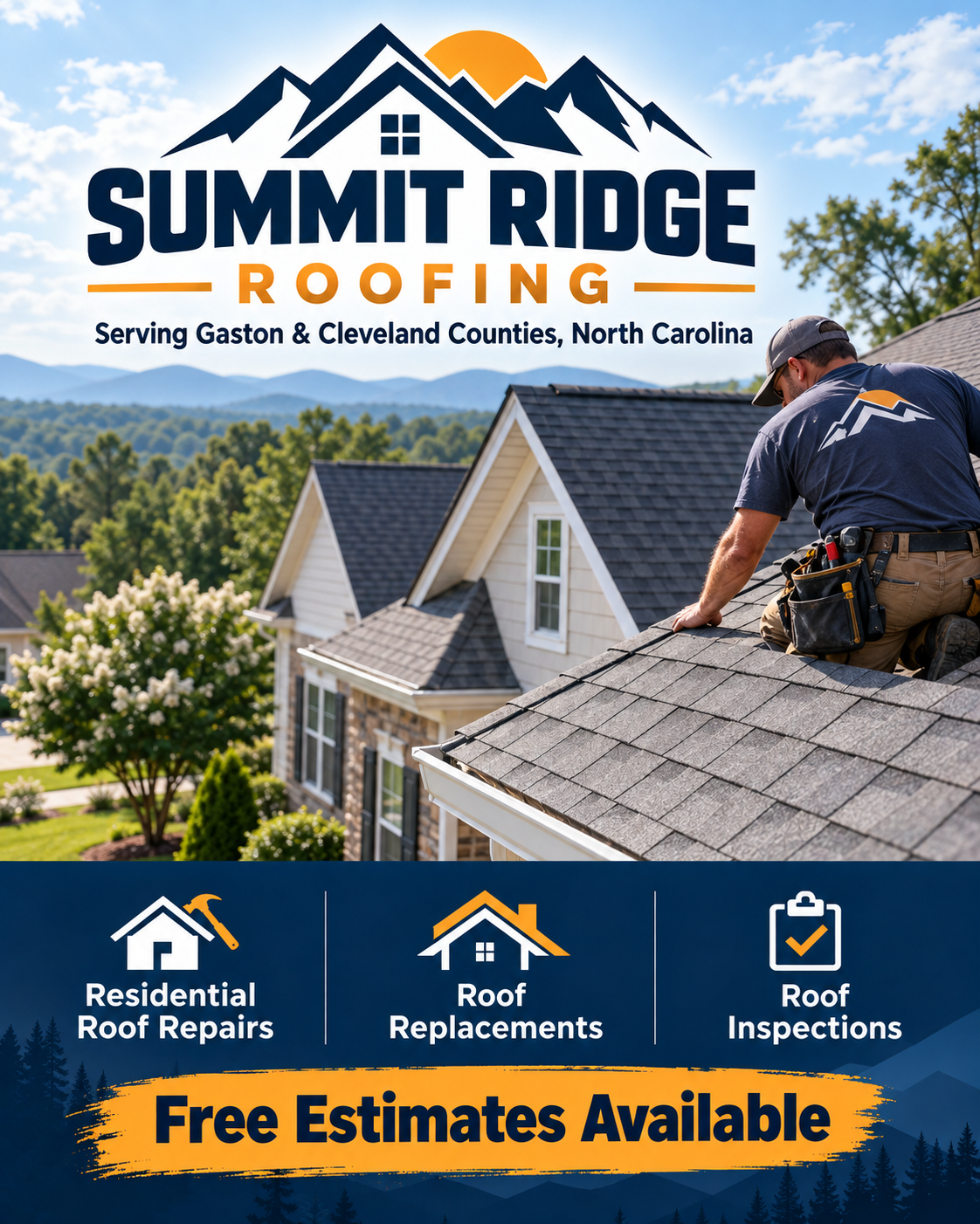
Fictional Summit Ridge Roofing flyer: navy and orange invented branding, a roofer on a suburban house, three service icons and an estimate banner.
Blue Skillet Diner
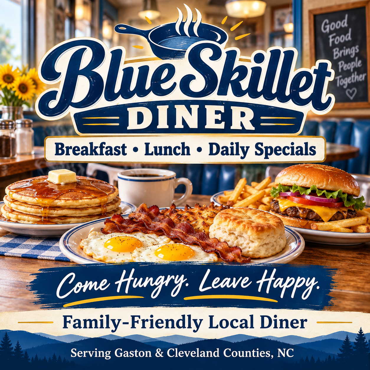
Fictional Blue Skillet Diner flyer: large script branding, breakfast and lunch food imagery, a slogan and a regional mountain silhouette.
Maple Street Cleaning
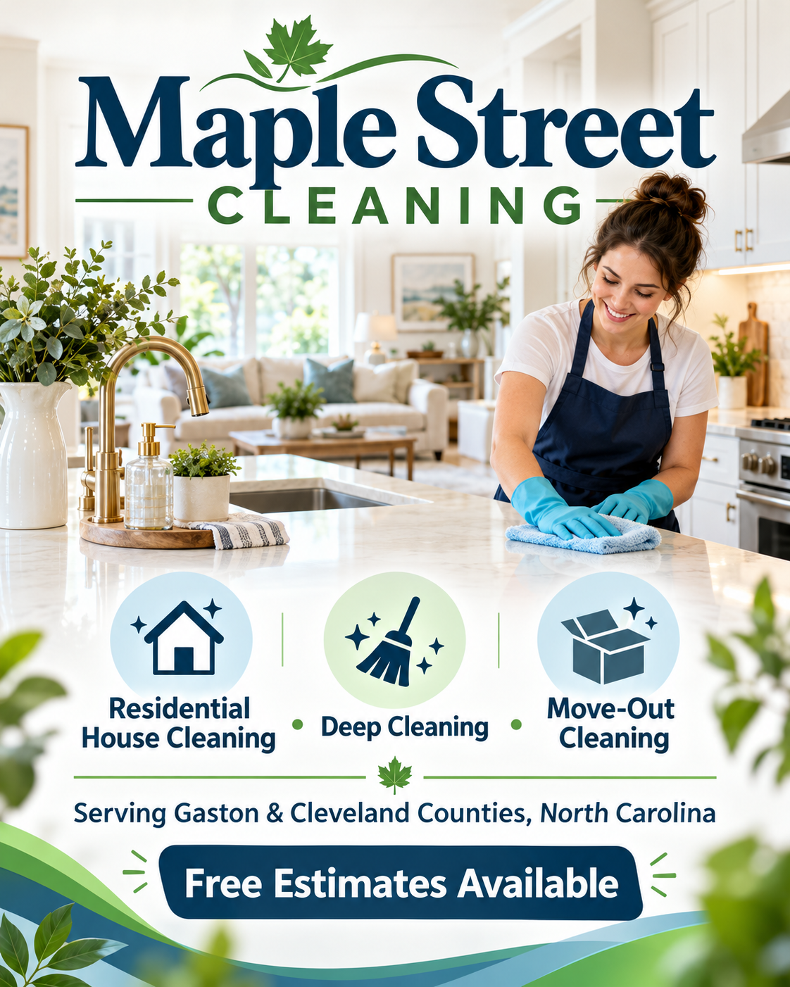
Fictional Maple Street Cleaning flyer: large navy and green branding, a cleaner in a bright kitchen, three service icons and an estimate banner.
Piedmont Lawn & Landscape
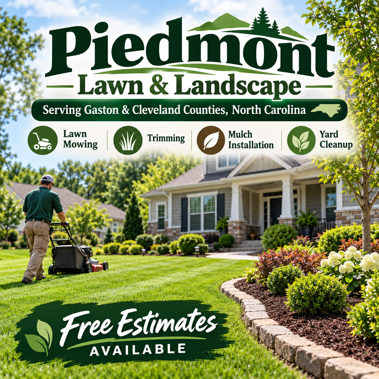
Fictional Piedmont Lawn and Landscape flyer: green branding, a worker mowing a landscaped lawn, a service-icon row and an estimate banner.
Carolina Comfort HVAC
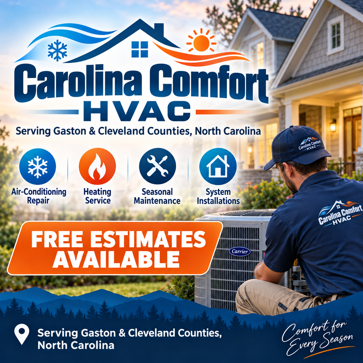
Fictional Carolina Comfort HVAC flyer: blue and orange invented branding, heating and cooling icons, a technician and a free-estimate banner.
Hometown Auto Care
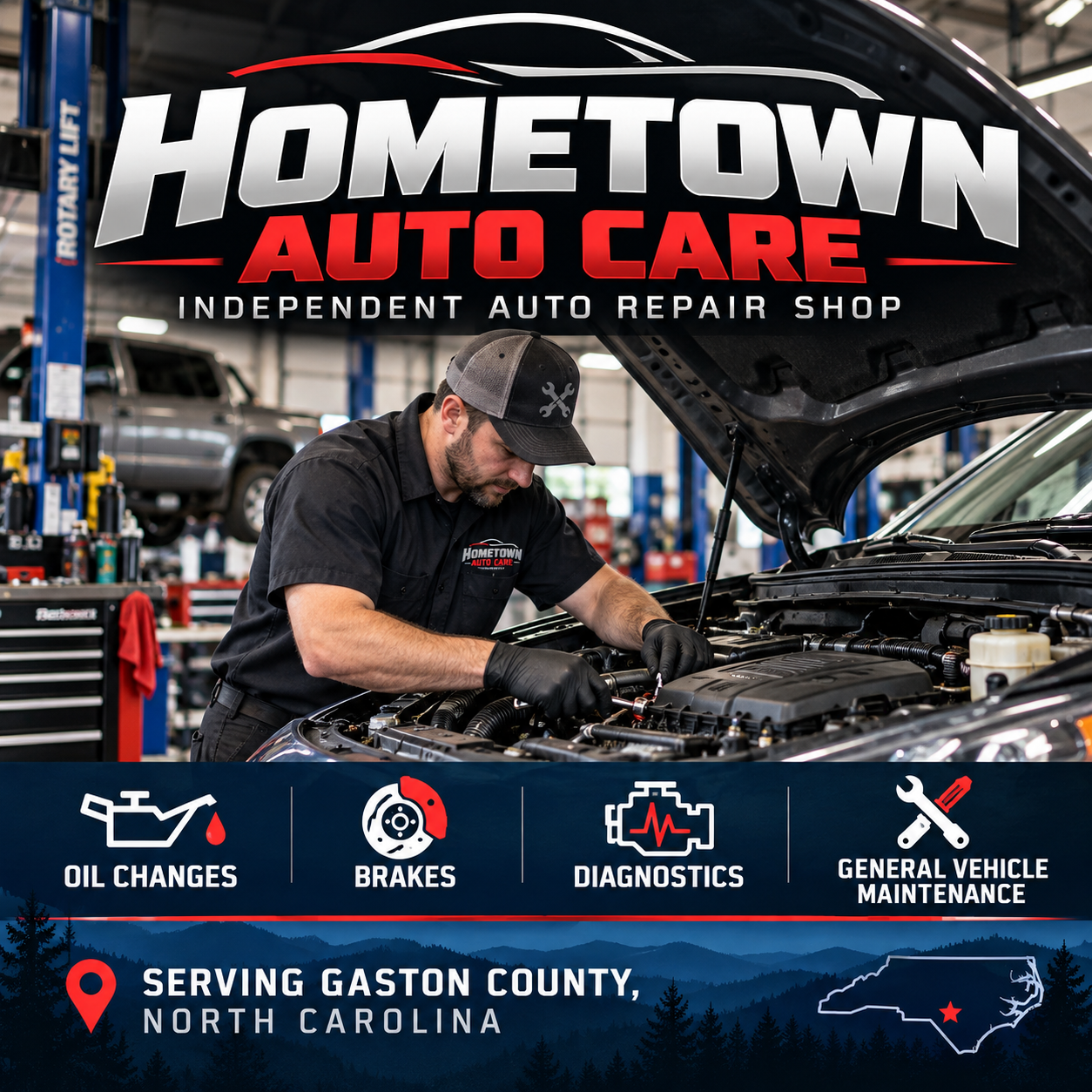
Fictional Hometown Auto Care flyer: metallic branding, a mechanic, four service icons and North Carolina imagery.
Six fictional businesses, six first-attempt ChatGPT flyers.
A roofing company gets a dramatic roofline logo, a technician on an attractive home, three service icons, and a large estimate banner.
A house-cleaning company gets a spotless kitchen, a smiling cleaner, a row of illustrated services, and another estimate banner.
A lawn-care company gets a beautifully landscaped property, illustrated service categories, and a prominent offer.
An HVAC contractor gets blue and orange graphics, heating and cooling symbols, a technician at work, and a big estimate announcement.
An auto repair shop gets aggressive lettering, a mechanic leaning over an engine, and a neat row of service icons.
The diner gets appetizing food photography and an elaborate, entirely invented brand identity.
Different businesses. Different colors. Different subjects.
But the underlying formulas are awfully familiar.
There were even recurring decorative regional touches, including mountain silhouettes, trees, and North Carolina imagery.
This wasn't necessarily bad design. Most of the flyers clearly communicated their industries, and several were attractive.
They were good in much the same way.
And that's a problem if the goal is to build a recognizable identity rather than simply announce that your business exists.
Why Does This Happen?
When you ask an AI image generator to create a flyer for a roofing company, you haven't given it much to work with.
It knows what roofing companies generally advertise. It can produce recognizable imagery, familiar marketing language, and layouts that resemble conventional promotional material.
But it doesn't know the roofer.
It doesn't know whether the owner has worked in the trade for 30 years, whether the company specializes in historic homes, or whether its reputation was built on neighbors recommending it to neighbors.
It doesn't know whether the business already uses a simple black-and-white logo or a bright orange truck that everybody in town recognizes.
Unless you provide those details, the model fills in the gaps.
And it can fill them in with remarkable confidence.
It might invent a logo, tagline, color palette, employee uniform, and entire visual identity before you've even decided whether you like blue.
That confidence is part of what makes these tools impressive. It's also why you need to remain involved.
A visually complete advertisement is not necessarily a strategically complete advertisement.
Different AI image generators have different capabilities and stylistic tendencies, but the underlying lesson applies broadly: the less direction you provide, the more creative decisions you leave to the tool.
And those decisions may reflect familiar industry conventions rather than anything distinctive about your business.
I Tried Making the Same Flyer Four Different Ways
For my next experiment, I created another fictional business: Carolina Creek Pressure Washing.
This time, instead of starting fresh each time, I stayed in the same ChatGPT conversation and kept refining the design.
You ask for something, see what comes back, then say, "That's pretty good, but can you change a few things?"
Round One: The Basic Prompt
My first request was simple:
Create a professional, eye-catching Facebook flyer for Carolina Creek Pressure Washing. We serve Gaston and Cleveland counties, North Carolina, offering residential pressure washing for driveways, siding, decks, and patios. Free estimates available.
ChatGPT delivered a polished, colorful advertisement.
I got a large company logo featuring rooflines, trees, and waves. An immaculate suburban house. Four service listings with icons. Multiple circular photographs. A giant free-estimates badge surrounded by splashing water.
There were water waves near the logo, water waves across the bottom, decorative droplets, and water effects around the offer.
Apparently, pressure washing requires reminding the audience about water at every possible opportunity.
But in fairness, the advertisement looked professional and communicated the basic services.
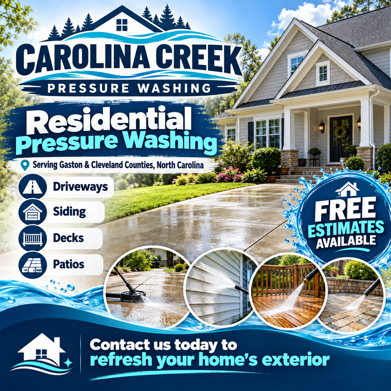
The broad prompt left most design choices to the tool. The contact invitation provides no contact method.
There was one practical omission: the flyer invited people to contact the company, but didn't include a phone number, website, or other contact method. It also showed generated properties and branding, not documented work by an actual contractor.
I hadn't supplied one, so that wasn't really a failure to follow my instructions.
It was, however, a reminder that a finished-looking advertisement isn't necessarily ready to publish.
Round Two: I Gave It More Information
For the second version, I explained that Carolina Creek was a small, owner-operated business serving everyday homeowners in rural communities and established neighborhoods.
I described the company's personality: dependable, affordable, honest, friendly, and focused on straightforward service rather than luxury properties.
Surely, that would transform the design. Well, not exactly.
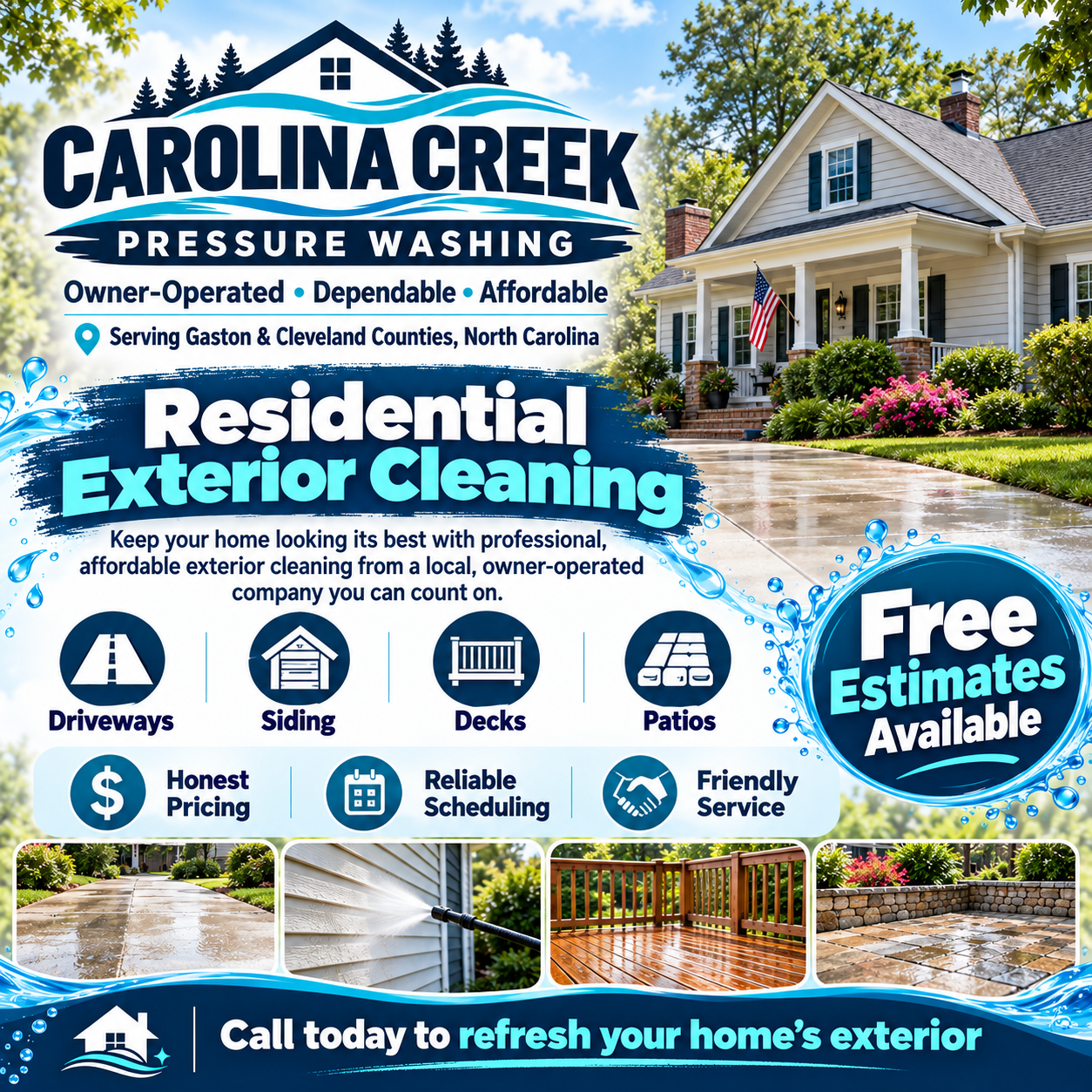
Additional business context improved the message but also increased information density.
The model incorporated my new information. It added phrases about being owner-operated, dependable, and affordable.
It also added more icons, more descriptions, and an additional row explaining the company's values.
I gave it more information, and it responded by finding more things to squeeze onto the flyer.
In some ways, it became even busier.
More information doesn't automatically produce better design. Sometimes it just produces more information on the design.
Round Three: I Told It What to Stop Doing
This time, I tried something different.
Rather than simply explaining the business, I gave specific instructions about the design itself.
No decorative water waves. No splash effects. No circular service icons. No elaborate promotional badges. No brush-stroke backgrounds. No collage of photographs. No excessive marketing language.
Instead, I requested one believable residential photo-style image, straightforward typography, breathing room, and a clear information hierarchy.
The difference was dramatic.
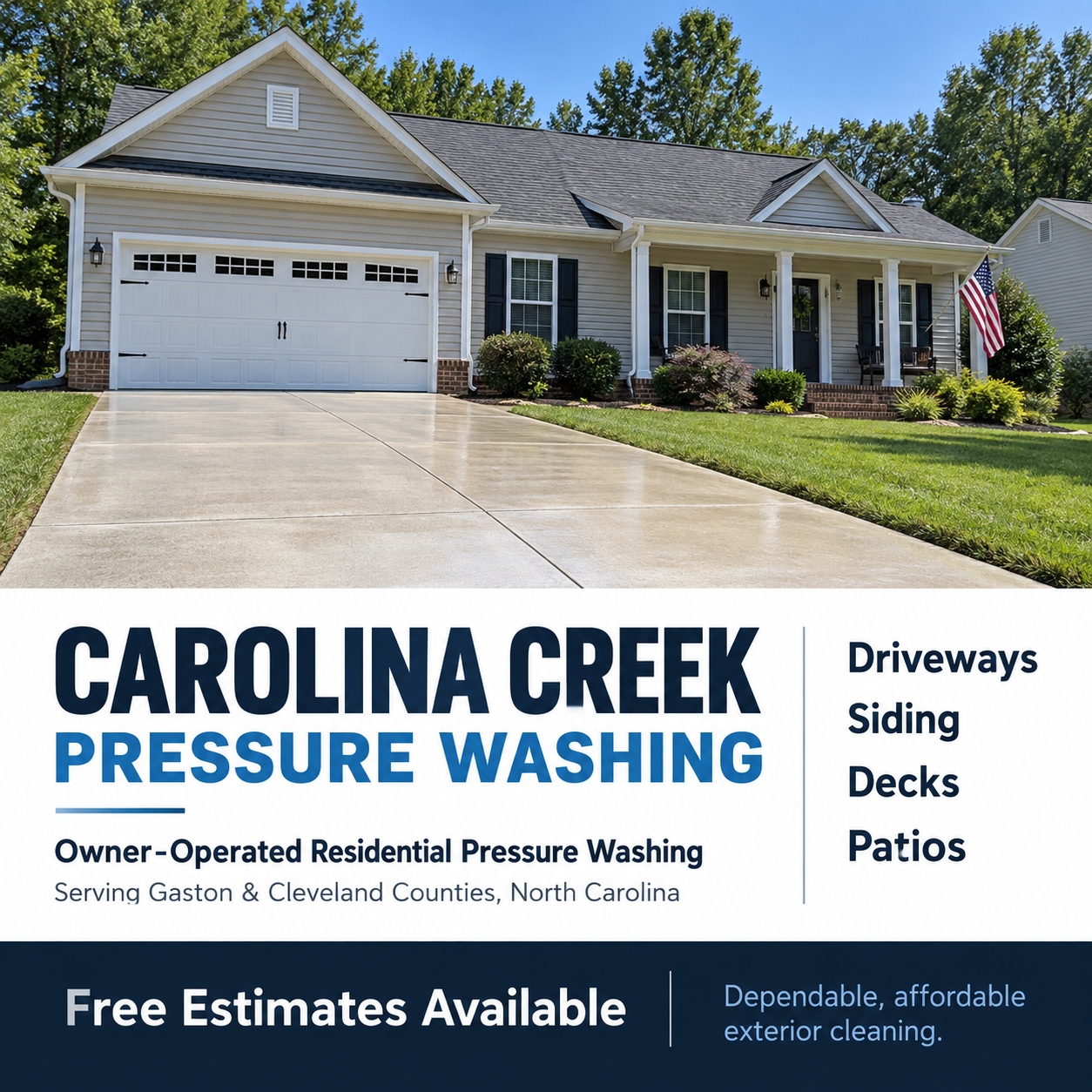
Explicit constraints removed most decorative effects. The property remains a generated illustration, not a portfolio photograph.
Suddenly, most of the visual clutter was gone.
There was one main photograph, a bold company name, an uncomplicated list of services, and a clear free-estimates announcement.
It felt calmer and more practical.
Was it perfect? No.
The photograph was still fairly generic, and the company still didn't have much of a recognizable personality.
But this version demonstrated something many casual AI users overlook:
Telling AI what you don't want can be nearly as useful as telling it what you do want.
That simpler arrangement also illustrates visual hierarchy: the design guides your eye through the information in order of importance. Nielsen Norman Group explains how contrast, scale, and grouping establish that order. On a flyer, the practical question is: what should someone notice first, second, and third?
Round Four: I Actually Gave It Art Direction
For the final version, I stopped treating the AI like a vending machine for advertisements and started treating it like a design assistant.
I described the company as a dependable local tradesperson whose reputation came from honest work and word-of-mouth recommendations.
I asked for visual inspiration from traditional Southern hardware-store advertising, combined with contemporary editorial design.
I specified a restrained palette of navy, warm cream, and rusty orange. Strong typography. One believable photo-style scene of someone pressure-washing a driveway. An ordinary Carolina home, not a luxury property.
I also simplified the message and made the call to action specific: "Free Estimates: Message Us Today."
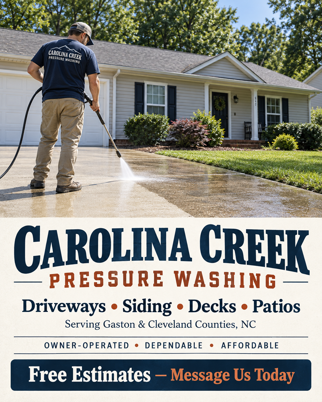
Specific art direction produced a more grounded identity. The worker, property and branding remain fictional.
Now I had something that felt more appropriate for the particular business I'd described.
The huge stylized branding and decorative effects were replaced by a generated image of a worker cleaning a driveway, bold traditional lettering, and a simpler arrangement.
It looked less like a generic pressure-washing advertisement and more like something an independent local contractor might actually choose.
It still needed human review. The worker and property were fictional. The CTA assumed customers could message the company. The typography needed to be checked at mobile size.
But it was a much stronger starting point for building a recognizable identity.
Basic prompt
Business context
Design constraints
Creative direction
The lesson wasn't that the fourth flyer was objectively the best design for everyone.
It was that I finally started making intentional choices about what the advertisement should communicate visually.
Your Real Work Beats Any Generated Image
Here’s the part no prompt can fix. A generated worker on a generated driveway will never be as convincing as a photo of your crew on a job you actually finished.
If you do work people want to see, like roofing, painting, landscaping or remodeling, your own before-and-after photos are the strongest thing you can put on a flyer. Your real logo, your real truck and your real customers’ results do more for your reputation than any polished, stock-style image.
Let AI help with the layout, the wording and the finishing touches. Let your actual work be the proof.
Sometimes Loud and Ridiculous Is Exactly Right
Minimalism isn't automatically better design.
A playful restaurant promotion, children's event, Halloween campaign, or unusual local business might benefit from a loud, colorful, deliberately over-the-top advertisement.
The difference is intention.
Does the visual style make sense for the business and the campaign? Does it make people notice the right message? Is the information still readable?
A busy design that confidently expresses a business's personality can work better than a restrained design with no personality at all.
The goal is to make the design choices deliberate.
You Don't Have to Know How to Write a Great Prompt
At this point, some readers might reasonably be thinking:
"That's great, but I don't know the first thing about typography, visual hierarchy, or art direction."
Fair enough.
Most people running a small business have more pressing concerns than whether their advertisement needs an editorial layout or a restrained color palette.
Fortunately, there's a simple trick.
Ask the AI to help you write the prompt before asking it to make the flyer.
Instead of starting with "Make me a professional flyer," try this:
I want to create a Facebook flyer advertising my small business, but I'm not experienced with graphic design or writing AI prompts.
Before generating anything, act as my creative director.
Ask me five useful questions, one at a time, about my business, customers, advertising goal, existing branding, and the impression I want to make.
Then use my answers to help write a detailed image-generation prompt that will produce something distinctive rather than a generic advertisement.
Explain your recommendations in plain language.
Maybe it asks whether you have an existing logo. Maybe it asks who your typical customer is, which service you most want to promote, or whether you have real photos of your work.
Those are useful questions.
And answering them before generating an image gives the tool something more meaningful to work with.
Already Have a Flyer? Ask AI to Critique It.
Here's another approach:
Review this flyer as a graphic designer and small-business marketing advisor. What looks generic? What's competing for attention? What's missing? Suggest five specific improvements, explain why they matter, and help me write a prompt to implement them.
You can even ask it to identify which elements are essential and which are just decoration.
Of course, AI isn't automatically right about design. It can offer questionable advice or push you toward another set of clichés.
You're still the person who knows your business, your customers, and your community.
The idea is to use AI as a creative partner, not surrender every decision to it.
Five Ingredients of a Better AI Flyer Prompt
Whether you write your own prompt or have AI help you, these five ingredients will give you a stronger starting point.
1. The purpose
What are you actually advertising? A new business? A weekend special? A particular service? An event?
And what should someone do after seeing the flyer?
2. The audience
Who are you trying to reach?
"Homeowners" is a start. "Homeowners in older neighborhoods who need affordable driveway cleaning" gives the tool more useful direction.
3. Your business identity
Are you established, friendly, rugged, playful, understated, traditional, or something else?
What makes you different from a dozen competitors?
If you have an actual logo, business colors, employee photos, or a recognizable truck, provide those instead of letting AI invent replacements.
4. The visual direction
Describe the look and feel.
Do you want something inspired by vintage newspaper advertising? A modern editorial layout? Bold, playful colors? Simple typography and one strong photograph?
And don't hesitate to say what you want to avoid.
5. The practical requirements
Tell the tool where the flyer will appear, what information must be included, what should receive the most attention, and what details cannot be invented.
A Facebook feed graphic has different practical needs from a printed poster or a roadside sign.
The more specific you are about the job the design needs to do, the less guessing the AI has to do.
A Prompt Template You Can Adapt
Copy this, replace the brackets, and remove anything that doesn't apply. Supply the exact wording you want readers to see.
Create a [platform and dimensions] advertisement for [business name].
Purpose: Promote [one service, offer, or event]. The reader should [specific action].
Audience: [Who they are, where they live, and the problem they need solved].
Business personality: [Three useful traits] backed by [real details that make this business distinctive].
Existing brand: Use the supplied [logo, colors, and real photos]. Do not invent a replacement logo, testimonials, credentials, prices, or contact details.
Visual direction: [The style and mood]. Use [one dominant image or another deliberate layout], a clear headline, and room around the important information. Avoid [specific unwanted effects].
Exact text: [Business name, headline, services, offer terms, service area, and verified contact method].
Priorities: Make [most important message] prominent. Keep the CTA readable on a phone. Use high-contrast text and preserve the supplied logo's proportions.
Before generating: Ask about any missing information that is necessary to make the advertisement accurate. Keep business background as creative guidance; don't squeeze every detail onto the flyer.
Your First Result Is a Draft, Not a Finished Advertisement
One of the easiest mistakes to make with AI-generated graphics is assuming that because something looks finished, the work is finished.
A polished image can create a false sense of completion.
But here's how I'd encourage you to think about it:
Imagine hiring a graphic designer, explaining your business in one sentence, and receiving an initial concept.
Would you automatically publish that first sketch without discussing it?
Probably not.
You'd ask questions.
Could the headline be shorter? Does the image represent our customers? Can we use a real photograph? Is the phone number large enough? Does this look like something we'd actually put our name on?
The same process applies when working with AI.
Start with what it gets right. Then identify what needs improvement.
Make targeted requests rather than simply saying "Make it better."
And sometimes, instead of requesting yet another variation, you'll get better results by taking the generated visual into Canva or another design editor to handle the final text, spacing, and branding yourself.
AI can generate a starting point quickly. That doesn't mean every finishing touch should be left to AI.
Before You Post, Check the Details
There's another reason to review every AI-generated advertisement carefully: accuracy.
A graphic can look terrific while containing a misspelled business name, incorrect phone number, invented service, or a QR code that doesn't work.
And it doesn't matter how beautiful the design is if customers can't figure out how to contact you.
Before posting, take a minute to check:
Make sure your text stands out clearly from the background. If you can’t read it on your phone in bright sunlight, your customers can’t either.
Also put the essential offer and contact details in the post text itself, not just in the image. Some people use screen readers, and nobody should have to squint at pixels to find your phone number.
For critical information, check the final text yourself and, when practical, add it in a proper layout editor.
An AI-generated advertisement should never get a free pass on accuracy just because it looks professional.
The Goal Isn't to Hide That You Used AI
There's a growing tendency online to dismiss certain graphics the moment somebody thinks they recognize AI involvement.
Sometimes that criticism is fair. Sometimes it's based on little more than an assumption.
Either way, if people spend more time arguing about how your advertisement was made than noticing what you're advertising, something has gone wrong with the communication.
But I don't think the answer is teaching business owners to disguise AI involvement.
The answer is helping them create better advertising.
Technology has always changed the tools available to small businesses. Desktop publishing, digital photography, stock imagery, website builders, and ready-made templates all made certain creative tasks more accessible.
Generative AI is another major change in that evolution.
The opportunity is real, especially for independent businesses operating on limited budgets.
But the tool still needs direction.
Your business has a history, a personality, customers, employees, and a place in its community. Those are the things that make your advertising distinctive.
AI can't know all of that unless you tell it.
So use the technology. Experiment with it. Ask questions. Make revisions. Let it help you develop ideas you might not have considered.
Just don't confuse getting an impressive-looking result with getting the right result.
Because the goal isn't to make something that looks like it was designed for your industry. It's to make something that looks like it belongs to your business.
At David Turner Designs, we help small businesses throughout the Carolinas build recognizable digital identities, from websites and local SEO to branding and marketing materials. If your tools are producing polished work that still doesn't feel like your business, let's talk.
How I ran this
All of the businesses and flyers in this article are fictional. They are a small set of practical examples, not a scientific test or a representative sample of AI advertising, and they do not show how every AI tool performs or how audiences respond.
Each flyer in the six-business test was a first-attempt result from a fresh ChatGPT conversation, kept without revisions. Some requests also told ChatGPT to disregard earlier conversations and personalization. That was a precaution, not proof of isolation, since fresh chats can still be affected by account settings.
The four Carolina Creek flyers came from one continuing conversation, so earlier versions may have influenced later ones, and the final version also changed aspect ratio. I can’t separate those effects from the wording of each new prompt.